Introduction
Often economic and other Machine Learning data are of different units or sizes making either estimation, interpretation or visualization difficult. The solution to these issues can be handled if the data can be transformed to unitless or data of similar magnitude. When the need to transform thus arises, then one finds it difficult to get handy function to achieve that.
In this blog, I share with you a function data_transform from Dyn4cast package that can easily transform your data.frame for estimation and visualization purposes. It is a one line code and easy to use. The usage is as follows:
data_transform(data, method, x, MARGIN)
data clean numeric data frame
method method of transformation or standardization: 1 = min-max, 2 = log, 3 = mean-SD.
MARGIN optional, to indicate if the data is column-wise or row-wise. Defaults to coulmn-wise if not indicate
Load library
library(Dyn4cast)
Transform <- readRDS("data/Transform.RDS")
Visualize the raw data without any transformation
data0 <- Transform %>%
  pivot_longer(!X, names_to = "Factors", values_to = "Data")

ggplot(data = data0, aes(x = X, y = Data, fill = Factors, color = Factors)) +
  geom_line() +
  scale_fill_brewer(palette = "Set1") +
  scale_color_brewer(palette = "Set1") +
  labs(y = "Data", x = "Series", color = "Factors") +
  theme_bw(base_size = 12)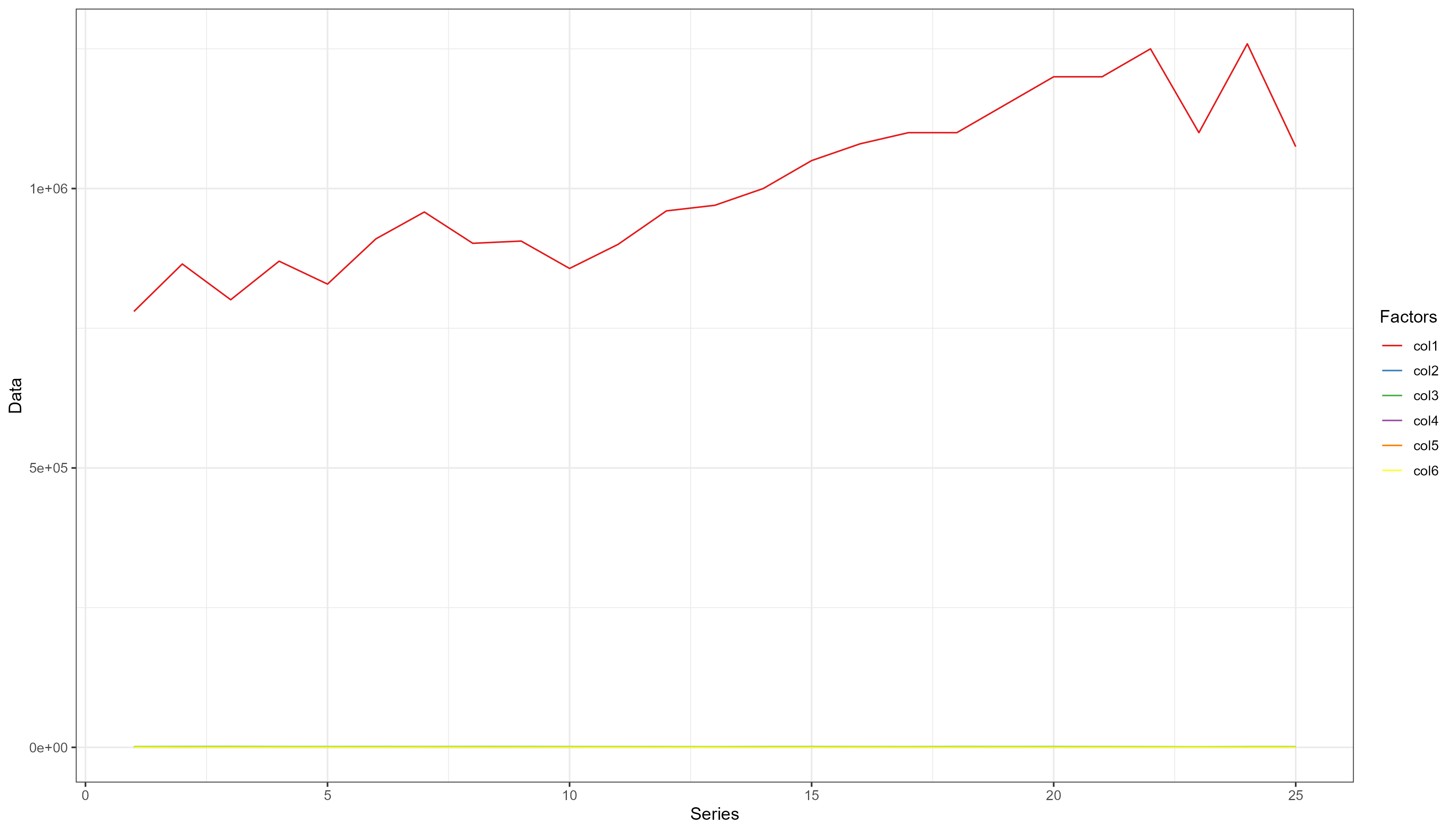
The pattern of the smaller data is hidden by the larger data, it is even difficult to see their distribution
Transformation by min-max method
You could also transform the X column but is is better not to.
data11 <- data1 <- data_transform(Transform[, -1], 1)
data1 <- cbind(Transform[, 1], data1)
data1 <- data1 %>%
  pivot_longer(!X, names_to = "Factors", values_to = "Data")

ggplot(data = data1, aes(x = X, y = Data, fill = Factors, color = Factors)) +
  geom_line() +
  scale_fill_brewer(palette = "Set1") +
  scale_color_brewer(palette = "Set1") +
  labs(y = "Data", x = "Series", color = "Factors") +
  theme_bw(base_size = 12)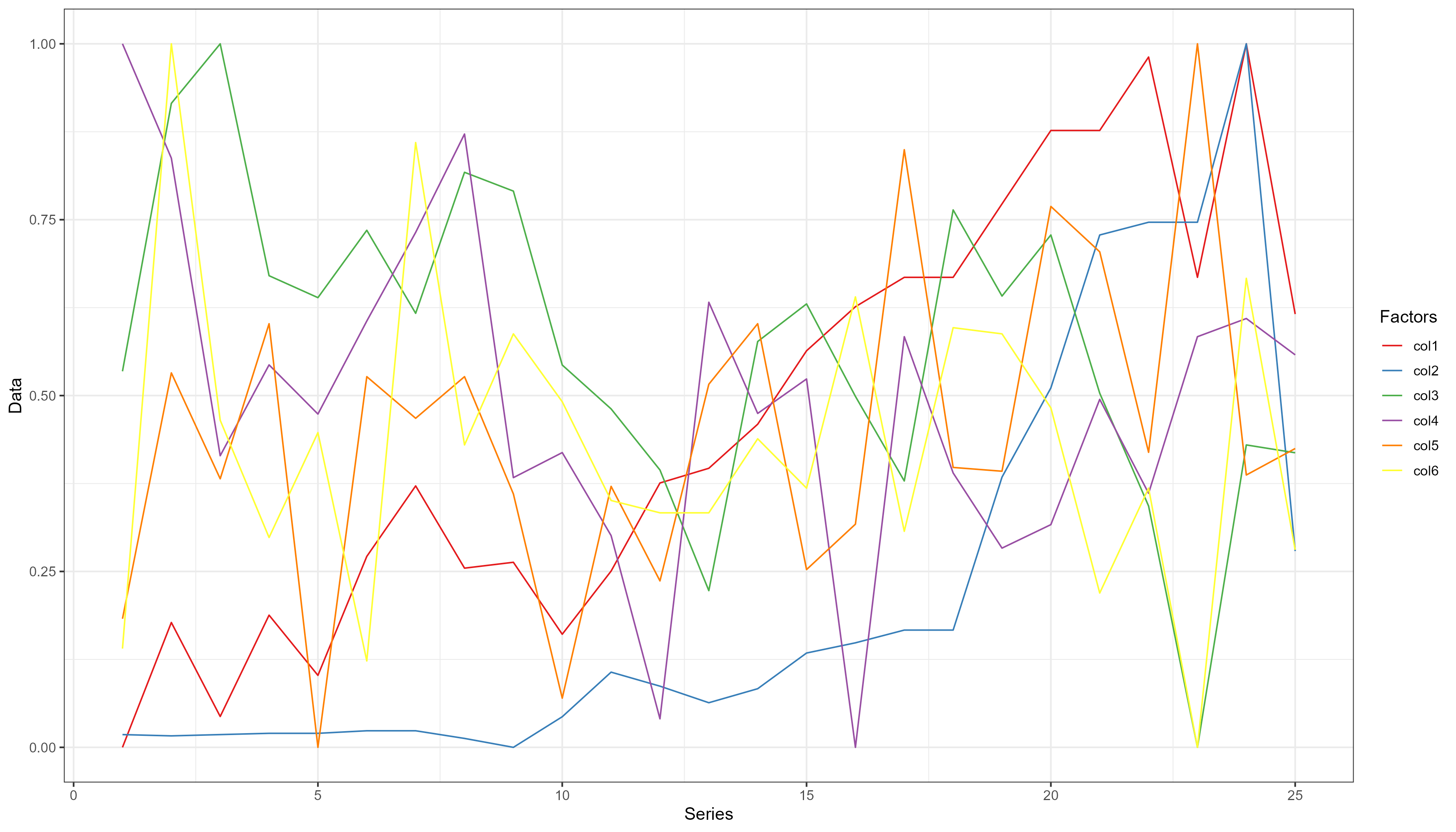
The pattern of each of the variables are now very evident.
log transformation of the data
data21 <- data2 <- data_transform(Transform[, -1], 2)
data2 <- cbind(Transform[, 1], data2)
data2 <- data2 %>%
  pivot_longer(!X, names_to = "Factors", values_to = "Data")

ggplot(data = data2, aes(x = X, y = Data, fill = Factors, color = Factors)) +
  geom_line() +
  scale_fill_brewer(palette = "Set1") +
  scale_color_brewer(palette = "Set1") +
  labs(y = "Data", x = "Series", color = "Factors") +
  theme_bw(base_size = 12)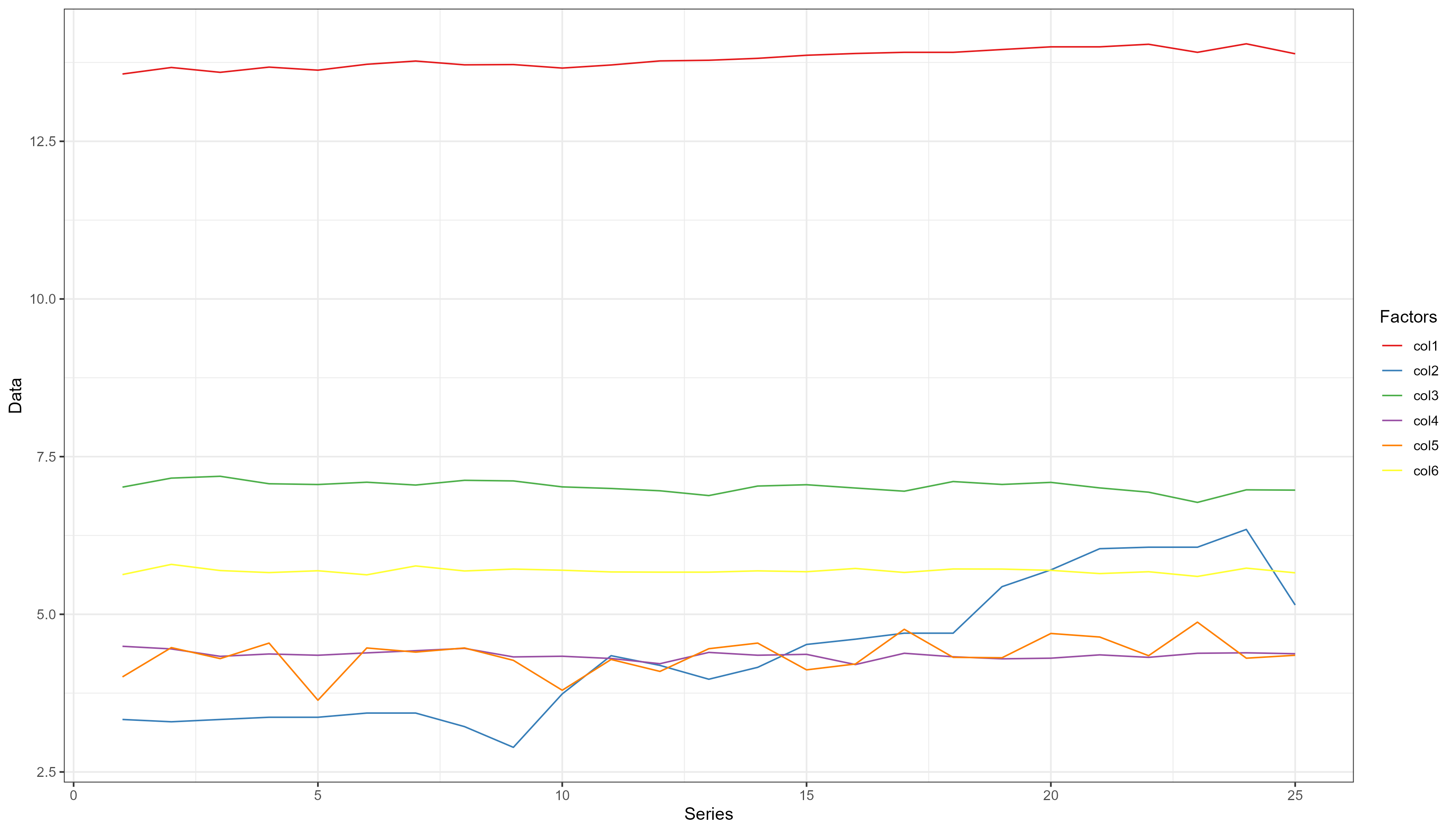
log is a linear transformation of the data. The pattern are shown but much less that the transformation with min-max method.
Mean-SD transformation
data31 <- data3 <- data_transform(Transform[, -1], 3)
data3 <- cbind(Transform[, 1], data3)
data3 <- data3 %>%
  pivot_longer(!X, names_to = "Factors", values_to = "Data")

ggplot(data = data3, aes(x = X, y = Data, fill = Factors, color = Factors)) +
  geom_line() +
  scale_fill_brewer(palette = "Set1") +
  scale_color_brewer(palette = "Set1") +
  labs(y = "Data", x = "Series", color = "Factors") +
  theme_bw(base_size = 12)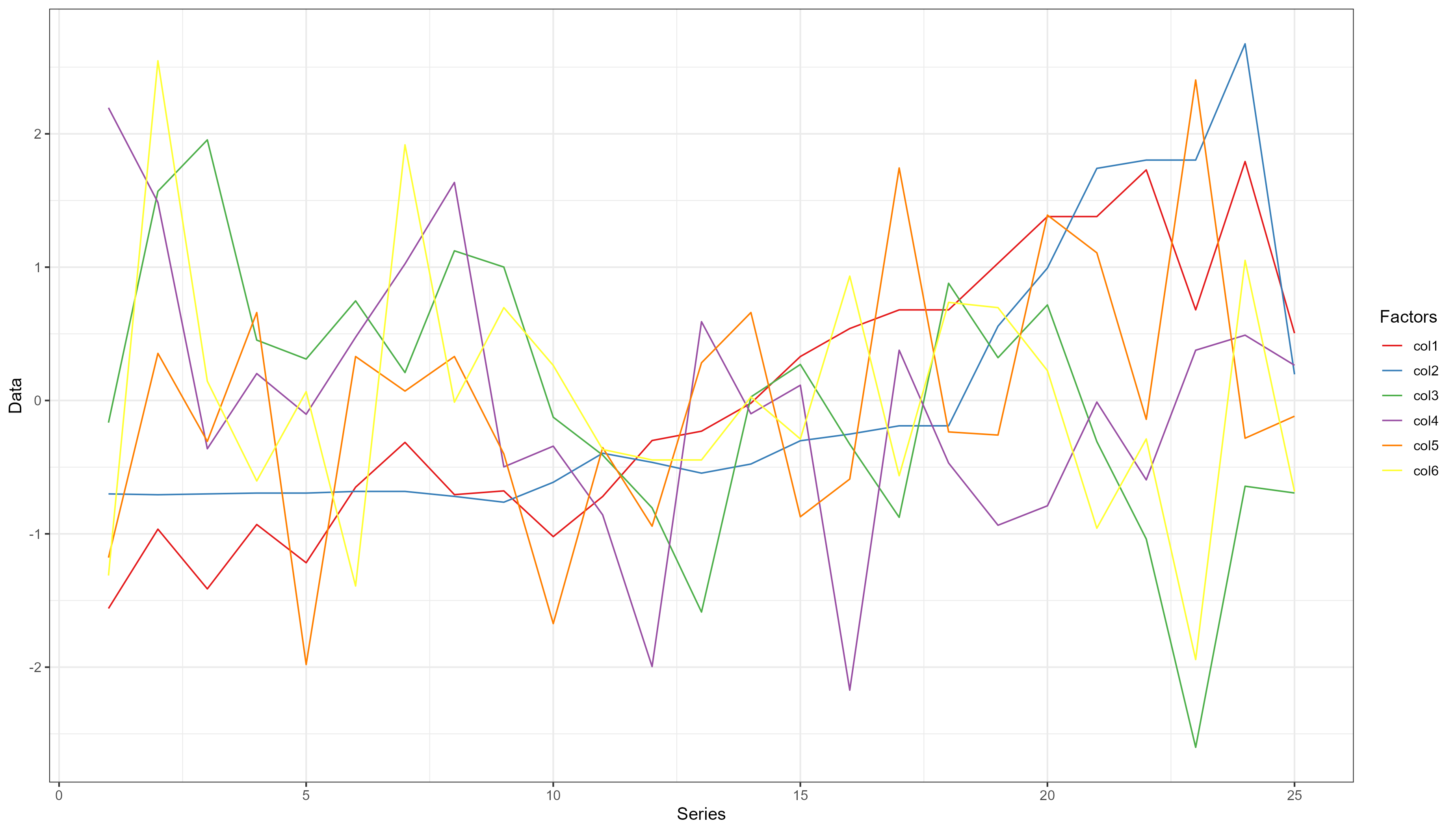
Much similar to the min-max transformation, but the essential pattern of the data is evident.
Comparison of the linear regression of the raw and transformed data
Raw <- lm(col1 ~ ., data = Transform[, -1])

Data1 <- lm(col1 ~ ., data = data.frame(data11))

Data2 <- lm(col1 ~ ., data = data.frame(data21))

Data3 <- lm(col1 ~ ., data = data.frame(data31))

m_list <- list(Raw = Raw, Max = Data1, Log = Data2, Mean = Data3)

modelsummary::modelsummary(m_list, stars = TRUE, digits = 2)| Raw | Max | Log | Mean | |
|---|---|---|---|---|
| (Intercept) | 840399.559+ | 0.288+ | 10.042*** | 0.000 |
| (429034.752) | (0.140) | (1.804) | (0.099) | |
| col2 | 642.404*** | 0.740*** | 0.114*** | 0.722*** |
| (111.262) | (0.128) | (0.014) | (0.125) | |
| col3 | −114.479 | −0.107 | 0.016 | −0.079 |
| (195.042) | (0.183) | (0.168) | (0.135) | |
| col4 | −6770.682* | −0.317* | −0.189 | −0.244* |
| (2935.693) | (0.138) | (0.180) | (0.106) | |
| col5 | 1422.072+ | 0.276+ | 0.093* | 0.211+ |
| (776.594) | (0.151) | (0.044) | (0.115) | |
| col6 | 2088.735 | 0.249 | 0.629+ | 0.186 |
| (1357.125) | (0.161) | (0.302) | (0.121) | |
| Num.Obs. | 25 | 25 | 25 | 25 |
| R2 | 0.805 | 0.805 | 0.889 | 0.805 |
| R2 Adj. | 0.753 | 0.753 | 0.860 | 0.753 |
| AIC | 636.6 | −17.4 | −68.7 | 43.1 |
| BIC | 645.1 | −8.9 | −60.2 | 51.6 |
| Log.Lik. | −311.285 | 15.701 | 41.363 | −14.539 |
| F | 15.671 | 15.671 | 30.555 | 15.671 |
| RMSE | 61849.44 | 0.13 | 0.05 | 0.43 |
| + p < 0.1, * p < 0.05, ** p < 0.01, *** p < 0.001 |
modelsummary::modelplot(m_list)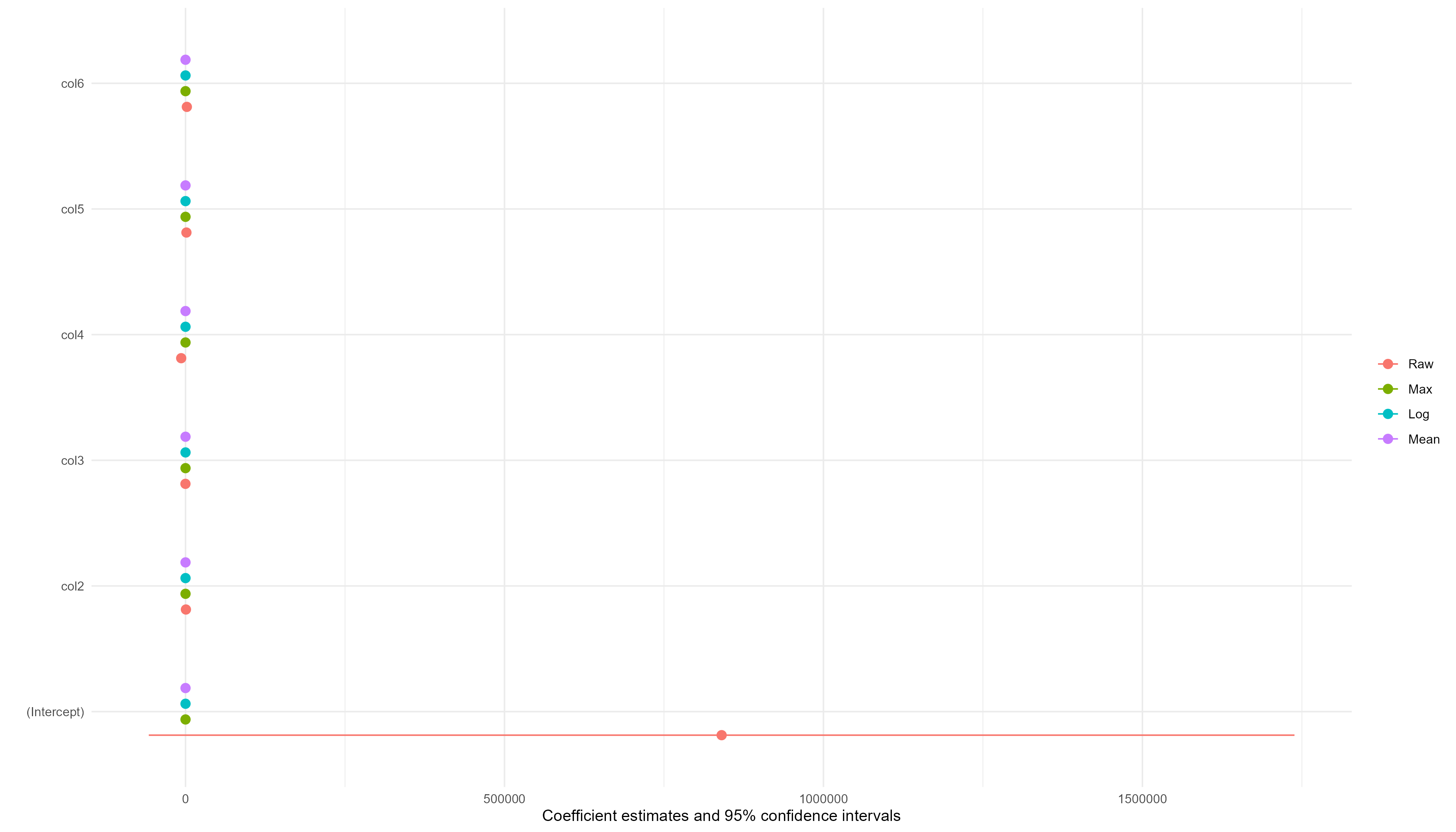
The coefficients of the transformed data are better than the coefficients of the raw data although the effects of the variables looks same except for the intercept and col4 and col5. Log transformation estimated a very significant intercept wheareas those of raw and max transformation are rarely significant. The Mean transformation did not estimate a significant intercept. All the transformations estimated a significant col4 except log wheareas log estimated a significant col5 while others are rarely significant.
In terms of the model properties, the log transformation is the best, followed by max, then Mean; and the raw data gave the worst model properties.